Oooooooh. I’m in a bind. A pickle. A dilemma. A quandary, even. In short, I am bemuddled, addled, flustered, and even… confused. I’m feeling just a bit like Winnie the Pooh, when he realized he had fluff in his head. And it’s all because of LINEN!
I’ve begun work on the pall I was talking about yesterday twice now, and I can’t decide on the linen to use. Both linens I’ve started out with have shortcomings for this project. May I tell you about them? Maybe someone out there will have a better solution for me that will put my mind at rest!
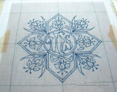
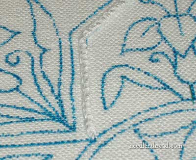
This was the first beginning of this pall project, and the embroidery design I chose is quite different from the one I showed you yesterday. I’m working this on a fine weave Belgian linen, a very fine weave. The linen itself is rather light, much lighter than the linen I’ve been working on in recent projects (like the blackwork fish and the floral glove). It’s not handkerchief weight – not that light – but it is relatively light.
And because it’s light, I started stitching on it with the finer sizes of coton a broder (30 and 40). But I didn’t like the fact that the design was so fine, because I wanted it to have some texture to it. But … too much texture, I thought, would not quite “fit” with this weight of linen.
What I like about this linen, and what made me select it in the first place, is that it is “bright white.” It’s the kind of bright white that, if you hold linen next to it that is just “white,” the “white” linen tends to look off-white or creamy. I really like the bright white, because it looks so very crisply white, which is nice.
But eventually, the weight of the linen won out over the bright white, and I went in search of a slightly heavier linen. Unfortunately, I didn’t have too much on hand to choose from, as my linen supply is almost depleted. I considered Alba Maxima, but it was really too heavy and thick-looking for the project, I thought (though I have made palls out of it before…)
Then I came across a piece of Alabaster Angel by Legacy, and I figured, ok. This would work. It seemed a bit smoother than the Alba Maxima, and so I set about working with it.
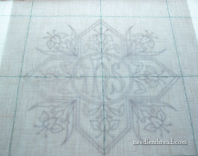
I went through the whole set up process on this piece. Since it is an even-weave, more or less, and since the weave is so visible because it’s not as fine (weight-wise) a linen as the Belgian linen I was using, I marked off guidelines along the weave of the linen, to make sure the whole piece was absolutely squared up. Then I put it on the light box and considered the design.
Since the linen was a lot heavier, I switched to the heavier design, and I enlarged it so that the pattern fills the pall. This way, I could use heavier weights of thread and achieve some interesting texture.
I traced the pattern – I’m using the Paper Mate Flair pen I spoke about the other day – and, once on, the design seemed very bold, and then the linen seemed very heavy, and then I started thinking I had made a mistake…
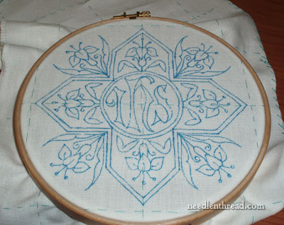
But before throwing the towel in, I hooped the piece up and decided I better put some stitching in. So I did….
Every type of line stitch I tried – from simple chain to whipped backstitch (which I like to use because it makes a nice pronounced line) to stem stitch – just didn’t do it. The line looked lost on the linen. So I resorted to a #16 coton a broder (the largest size I have) and worked some lines in Portuguese knotted stem stitch, which creates a nice textured line that was heavy enough not to look lost on this linen.
What I don’t like about the Alabaster Angel for this project is that it is a heavy linen – it seems almost “rough” for ecclesiastical linen – and it is “white,” but not bright white, so next to anything bright white, it looks almost creamy. This is even true, to an extent, with the threads on it. The coton a broder is definitely bright white and it seems very white against the linen.
And so, I face my dilemma. I don’t know why I’m having this dilemma in the first place; I normally don’t have to deliberate over ground fabric choices too much! But this project doesn’t seem to be coming together too well, and I don’t feel very confident about it. So this is where you come in – I figure 4,652 heads are better than one!
This is what I’m looking for: I need a linen that is a nice smooth-handed linen, fine but not transparent (heavier than shadow work linen and handkerchief linen), with a nice close weave that can support some texture, though not necessarily heavy texture, and that is Bright White. But I don’t have any in my stash, and I don’t have time to make a mistake on an order. If I order it and wait for it, it has to be the right stuff. Time is starting to run out…
Sooooo…. any suggestions on linen? Or any suggestions about the two projects above? Should I just stick with one or the other and forget being too persnickety? What to do, what to do? If you have any advice, feel free to leave a comment! I will consider right heartily anything you have to say!!
