Last year, I visited San Carlos Borromeo Mission in Carmel, California, and while there, I had permission to take photos of the vestments in their museum. I wrote a brief comparison of two sets of vestments, one from the museum in Carmel (this Salvator Mundi set) and the Splendor Patris set at the vestment museum in Clyde, Missouri, because the faces in the two sets struck me as similar.
I thought I’d show you two motifs from the Salvator Mundi set – one of which I plan to use as a springboard for another embroidery project.
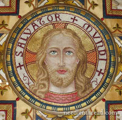
This is the main image on the back of the chasuble. It is Christ, Saviour of the World. For the color scheme in which the vestment is embroidered, I find the face and hair somewhat muted. It surprises me every time I see it. I like the treatment of the image, but I am surprised that the hair is not somewhat darker. Still, the colors and embroidery all seem to blend together so well, that I think it’s a very artistic rendition of the image (much more so than the similar vestment in the Clyde museum, which I don’t think is rendered quite as artistically).
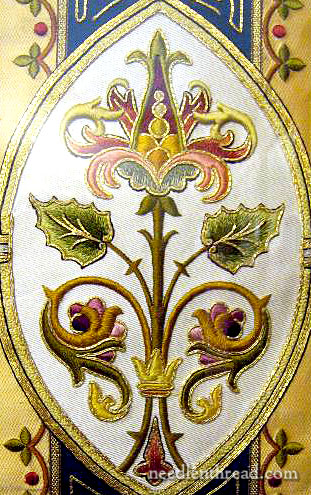
The set is embroidered in a color scheme that’s pretty nice – I like the muted reds, corals, blues, greens and golds. This is the motif I’d like to replicate in part, and then work up a variation. I think it would make an good study in silk embroidery, with a touch of gold – and a great piece for satin stitch!
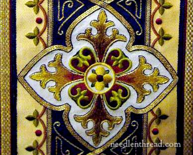
This little inset cross is also nice – it’s what I call a “typical” vestment cross. You find similar styled crosses as insets on vestments from the 1800’s (and perhaps earlier) through the mid 1900’s on vestments from all over the world. They don’t always have the same color scheme, maybe the decoration around the cross is slightly different, but the way it’s inset into the embroidery design down the back of the chasuble is fairly common. I like the treatment – I like the way the gold border surrounds the motif, and I think the colors on the arms of the cross are quite fine. Notice the black line on the very outside of the cross and around the gold that outlines the cross motif. This tiny line of dark is so important on ecclesiastical work. Because the items were made to be seen from afar, the tiny dark line really makes the elements stand out.
It’s a nice set of vestments. What I really like is the color scheme and that larger motif above. It reminds me of the elements on the silk stole I embroidered years ago, only they seem dull in comparison. The deeper colors of this motif above, and the use of gold to outline, make it rich.
So what do you think? Do you think this motif (the middle picture in the post here) would make a good study in silk work and satin stitch? Do you like it? Or no? If not, what don’t you like about it? I’m just polling about for opinions here! Input is always much appreciated! Feel free to leave a comment, if you have any suggestions, ideas, opinion, and so forth! I’m all ears!