Ecclesiastical embroidery always fascinates me! One of my favorite aspects to consider when contemplating different ecclesiastical embroidery pieces is the question of origin. I like to think about – and maybe try to find out about (if possible) – the origins of the piece, the origin of the designs and patterns used, and so forth. I also like to compare and contrast different pieces, especially those from different places. I’m always excited to find similarities between pieces, such as the similarities between these two embroidered faces of Christ, one from a museum in California and the other from a museum in Missouri.
Along those lines, I thought I’d show you pictures of two embroidered mitres that are very similar. I took a bit of liberty with the photos, and, playing around in Photoshop, I put them together so that you can see how similar they really are.
A mitre is a kind of cap, normally worn by a bishop, and often embellished elaborately with silk embroidery or goldwork or both. The mitre is peaked, and on the back of it, there are often two lappets, or ribbon-like pieces, that hang from the back of the mitre. Normally, the mitre is white, but in ecclesiastical usage, gold (on great feasts) can be substituted for white. Though the primary overall color is white or gold, the embellishment of the mitre may be colorful.
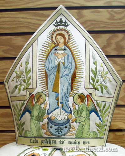
The mitre featured above is in the vestment museum of the Benedictine Sisters of Perpetual Adoration in Clyde, Missouri. It was made around the 1950’s, and is almost entirely embroidered in silk, in a needlepainted style, but accented with goldwork and with gems and pearls.
It should be noted that this is actually the back of the mitre. The lappets (which you can see at the base of the photo) are hanging down from this side of the mitre, which shows that it is the back of it.
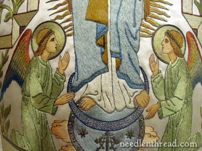
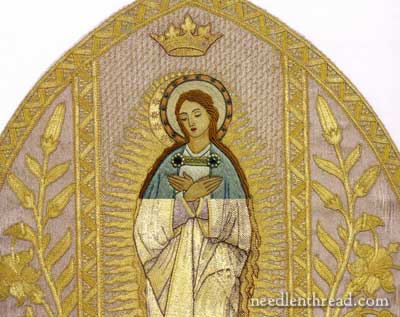
The central figure of the Virgin is standing on a representation of the moon and the earth and flanked by two kneeling angels, palms, and lilies. Above is a crown in real gold threads (which have since tarnished), and the nimbus is decorated with twelve gold stars. All of these are typical symbols associated with the Blessed Virgin. Symbolism is another thing that attracts me to ecclesiastical embroidery. Symbols abound in this type of embroidery, and because of that, the representations embroidered on ecclesiastical pieces normally tell a story of some sort. They “say” something. And I think it’s interesting not only to decipher their message, but to consider what is said in a broad context, and to make comparisons across different artistic mediums.
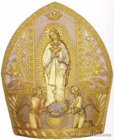
The mitre above is worked primarily in gold threads with some silk. It is the back of the mitre of Pope Pius IX (b. 1792 – d. 1878). I believe it has since been worn by other Popes. It is definitely “vintage” – old, and maybe a little damaged, but still beautiful. You can see, for example, on both the right and left sides of the mitre, at the side “points,” that there is some noticeable wear to the piece.
The two mitres are definitely similar. Here are the points of comparison:
1. The central figure
2. The crown above, tipped with fleur-de-lys
3. The flanking angels
4. The lilies
5. The palms
6. The moon and the earth
7. The nimbus with twelve stars
8. The layout and disposition of all figures, plus the rays behind the central figure
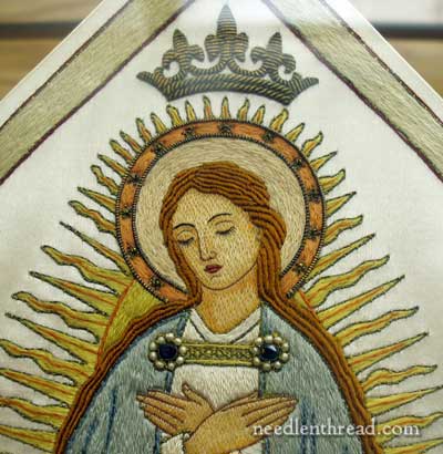
Here’s a closer image of the face of the Virgin on the Clyde mitre.
A similar image of the face on the Pius IX mitre shows a slight difference in the disposition of the head, but not a drastic difference. It is slightly more bowed, looking down. Notice that the hair is practically the same as far as layout goes, and notice that the rays behind the figure are the same. The disposition of the hands is the same. The clasps on the cloak, though adorned differently, are the same. The figure on the Pius IX (gold) mitre is more delicate looking overall, I think.
This is the base of the figure on the Clyde mitre.
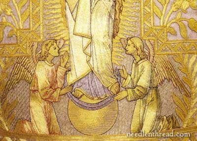
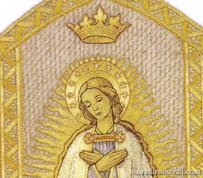
And here’s the base of the figure on the Pius IX mitre. Notice the position of the feet – the same. Notice the disposition of the angels – more or less the same, although the angel on the right in the gold mitre above is touching the moon with the right hand, but in the Clyde mitre, the right hand is raised.
The wings of the angels in the Clyde mitre are multicolored – they fit the decor of the chapel in which the mitre was used. The chapel is decorated in the Beuronese style (you can see more of it in this post on my visit to the monastery museum), and the wings and the overall look of the angels reflect the color and style of this type of art. The Clyde angels are much more “stylized” and somewhat stiff looking, while the Pius IX angels are a bit more natural looking. The facial expressions of the angels on the Clyde mitre are practically etched in stone, they are so stylized and formal. The facial expressions on the goldwork angels are definitely more relaxed and seem to show a bit more “personality.”
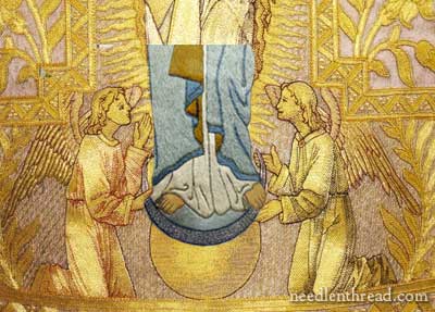
Having a little fun with Photoshop, I placed the colored embroidery on the goldwork mitre. Taking into account very minor differences, I think it’s fairly evident that the same pattern was used for both mitres. In fact, the feet and toes and their position and size line up right on top of each other in both images. There are some very slight differences in the fold of the robes – for example, in the Clyde mitre, there is a definitely split in the two sides of the blue cloak, showing a tiny bit of the white robe underneath. This split is not evident in the Piux IX mitre.
Playing a little further with the two images, I imposed the Clyde mitre on the goldwork mitre again, to show how the top part of the central figure is similar. The two halos are a bit off – they don’t line up perfectly, and I think this is due to the slightly more inclined head on the goldwork mitre. But the hands do match perfectly. So does the top of the cloak and clasp, and, for the most part, so does the hair.
A tale of two mitres, with at least 100 years between the making of the two. With slight adjustments to accommodate differences in the settings in which the mitres were used, you can see that the designs are more than just a little bit similar. Did the nuns in Clyde have access to the same pattern that was used for the Piux IX mitre at least a hundred years earlier? Or did they have an image of the Piux IX mitre that they worked from in developing their design?
Incidentally, the front of the Pius IX mitre features an image of Christ, the Good Shepherd:

I’ve not had the chance to view the front of the Clyde mitre, but I was told that it is an image of Christ. The Sister that I spoke to wasn’t sure if it was the “Sacred Heart” image, or if it was “Good Shepherd” image, but she thought it was one of the two.
My bet? The Good Shepherd.
Hope you enjoyed delving briefly into one of my favorite hobbies with me! Tomorrow, I’ll share with you a terrific thrift shop find, thanks to a reader, and Friday? I think that’s the day I’m posting something… gasp! … rude. Then, another video coming up, if all goes well this week. Heading into exam week on my side of the computer, so keep your fingers crossed that I can keep my act together for another week! See you tomorrow!