Art museums always fascinate me. My favorite part of any art museum is the galleries of paintings. Oh, sure, it’s nice to see artifacts and sculpture and so forth, but I really love looking at paintings. One thing I always look for in paintings is textiles. To me, there’s nothing more amazing than an artist’s rendition of embroidered clothing, fine lace, and so forth.
Often, when I’m squizzing around the internet looking for inspiration, I end up in online art galleries. Besides making note of art that features textiles, I find myself looking at color palettes. Looking at the colors that the masters have used in their work can be an interesting lesson in color, and with technology today, it’s pretty easy to extract color palettes from an image.
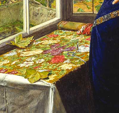
Take, for example, the above image. I like the colors. They remind me of late summer moving into autumn.
Now, let’s move over to a color palette generator and have some fun. For this exercise, I’m using DeGraeve’s color palette generator.
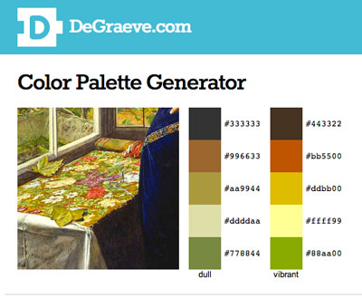
Two options pop up – dull and vibrant. I prefer the vibrant. Unfortunately, the generator doesn’t pick up what I would call the “poisons” in the image – the blue in the gown or the purple on the tapestry. Still, it’s interesting to see (in solid color form) what colors it does pick up, and to see how those colors work together.
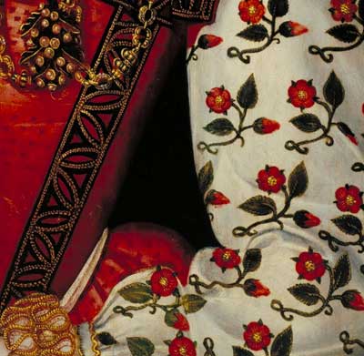
Here’s another one – looks like a pretty basic color set. (I love, love, love the sleeves in this portrait!)
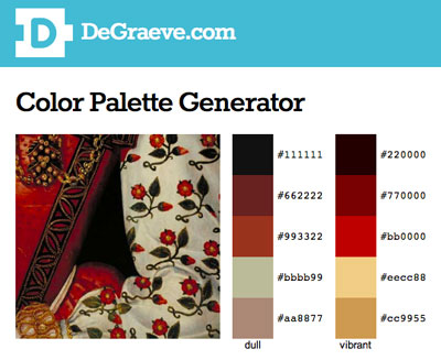
And again, I like the vibrant option that was picked up by the generator. It kind of reminds me of something I’ve seen before….
So if you’re looking around for color ideas for a project, consider taking a look at art galleries and color palette generators. I reckon that the master painters really knew something about color, so I don’t mind taking a light lesson from them when I need some ideas!
There are other color palette generators online that can be fun to play with. Just google “color palette generator” and you’ll come up with plenty with which to wile away your Saturday!
Have a great weekend!