While mucking about the other day with floche and satin stitch, I found myself wanting to check out a theory about contrast in stitches.
Imagine an embroidery project, where the one design has many separate elements. Try not to imagine a sampler-type design, with blocks or bands, but rather a coherent whole design, like the one I’m stitching on in these photos. (You can find a better view of this design in this article on embroidery design transfer – it’s the one on the right in the top photo.) Now imagine all the separate elements that make up the whole design stitched with different filling techniques. I think that it would look wrong – sloppy, even.
Now, mind you, I’m not saying that any embroidery with filled elements looks sloppy. Rather, my theory is that one design of many filled elements all stitched in different types of fillings might end up looking a bit bizarre and sloppy. Why is this? Too much contrast between the elements, taking away from a coherent whole? Perhaps. Too much for the eye to take in? Instead of the design producing an ordered movement of the eye, it may cause the eye to jump all over the place and not see the “whole” for the parts? Perhaps.
I don’t actually know for certain whether or not this is true. I’m just theorizing.
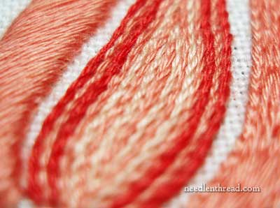
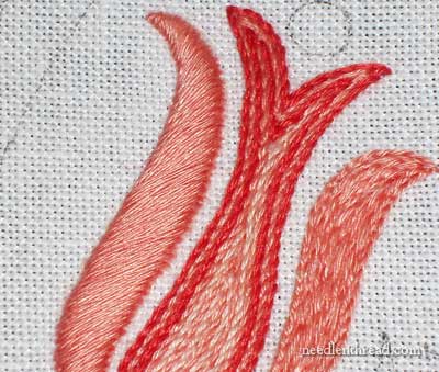
What I do know is that some contrast in embroidered fillings can work quite well. For example, the silky smoothness of satin stitch lined up next to the more textured stem stitch filling looks ok.
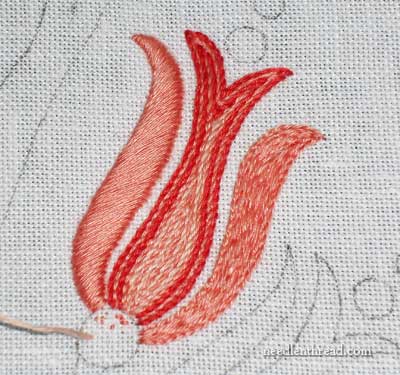
But if I were to leave the element on the right – which is filled with split stitch at the moment – as it is, it just wouldn’t look right, would it? Obviously, it throws things off balance. We expect both sides of that flower thing to be stitched the same, right? Even if the satin stitching that would be done on the right side of the flower is worked in the opposite direction (you can read about the correct slant on satin stitches here), it will still be satin stitch, and that’s what we expect to see there. Not only is the split stitch on the right a completely different type of stitching, but the stitch direction is vertical, following the flow of the element. The light plays off the stitches differently. If I were to leave that as it is, it would just look all wrong, wouldn’t it?
This isn’t to say that I’m shooting for a completely rigid symmetry in the piece, because I’m not. That’s evident with the shape of the center of the flower, which is somewhat wonky. And that brings me to a completely different theory, about shapes and fillings and stitch choice – but I suppose I should save that for another day!
So, what do you think? Do you think I can get away with using a slew of different embroidered fillings across the whole design, and still end up with a coherent whole? Any theories of your own on the subject? Feel free to leave a comment below and share them!