Remember last week when we discussed color choices and stitches for embroidery?
Today, I want to mention another point about color choices for embroidery projects, and it is this: the colors you choose, even if you like them (but especially if you don’t), can make your embroidery project a misery to work on.
There can be a number of reasons for this – sometimes they can be emotional or psychological. But one reason is more objective – it is a physical reason. It has to do with the eyes.
While the eye can see some seven million colors, there are certain colors and color combinations that can irritate the eyes, tire them out, even cause headaches and make the eyes go all squiggly-wonko.
So sometimes, when we combine certain colors in embroidery, our poor eyes end up strained and fatigued.
And while we might like the color combination – or we might think the color combination is fun and exciting – actually embroidering the color combination may be a different story.
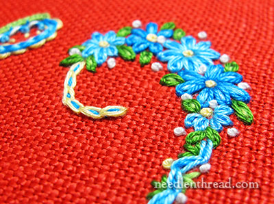
Working on an intense red background (this isn’t an orange-red – it’s a true red-red) with blues, greens and yellows that are also intense is an example of color choices that can weary the eyes while working with them.
Color choices like this can “trick” the eyes. When we focus for a while on a particularly intense color especially under the bright lights of a needlework lamp (or in the bright sunlight), the muscles in the eyes get tired. All the thousands of little “color decoder cones” in the eye that decode that particular color become fatigued, and to make up for the fatigue, all the other color-decoding cones for opposing colors get busy, decoding.
What happens? When you look away from the color, or move your focus slightly away from the color, you’ll see “ghost colors” or an after image in an opposing color to the color you were looking at.
These after images – which can look like a shadow or a different color altogether – can be irritating when you’re concentrating closely on a piece of embroidery.
Bright yellow is said to be the worst offender when it comes to eye fatigue. Bright colors reflect more light and overstimulate the eyes, irritating them (and usually irritating the person they belong to!).
So while a little splash of sunny yellow is a good thing and a very cheery thing, when considering colors (when it comes, for example, to decorating your house), “they say” (I don’t have a reference, because this is coming from memory, but I think it’s a well known point) that people are more likely to be irritated, angry, or frustrated in a bright yellow room. That’s why a conscientious teacher, for example, would never paint an entire classroom – or even a good portion of a classroom – yellow.
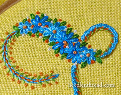
The sunshine yellow linen in the photo above, worked essentially with the same color scheme as the embroidery on the red linen, is not as difficult to work on as the red. That’s because there’s more of a contrast between the yellow and the embroidery on it than there is on the red piece. So, on the yellow linen, it’s easier to see the embroidery while it’s underway.
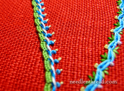
Still, stark contrasts can also play tricks on the eyes when you focus on them for too long.
If you’re working on a bright colored fabric that is already fatiguing to the eye, and you introduce bright contrasting colors that you have to focus on intensely while stitching, you may find when you move your eyes that you get a negative ghost image or after image on your fabric. Again, this can be really annoying while you’re stitching!
Color choices for embroidery are often a personal, subjective consideration (as evidenced in the comments on last week’s article on color choices for embroidery), but you can see that there are some points that are objective about color choice, too.
The moral of the story: if you’re launching into a Big Project, take pity on your eyes and choose your colors wisely!
But whether you are working on a project large or small, with vivid colors or not, one good habit to develop while stitching is to take an “eye break” every couple minutes – glance away from your embroidery and focus on something more distant. This will keep your most precious tools (your eyes) from over-fatiguing themselves.
Any eye tips to share? Feel free to have your say below!