Occasionally, I’ve been dribbling out photos of the embroidered letters in this monograph alphabet that I mentioned a few weeks back. They’ve also been showing up here and there on my Needle ‘n Thread Facebook page.
Today, I’ll show you a few more photos, discuss the project a bit, and ask for your input, too!
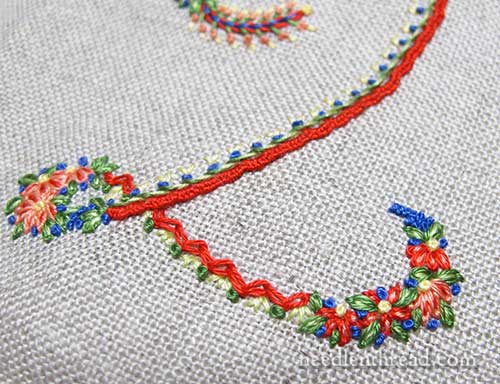
As mentioned in the previous article on these decorative initials, one of my goals in the whole project was to incorporate 25 or so stitches and combinations into the alphabet.
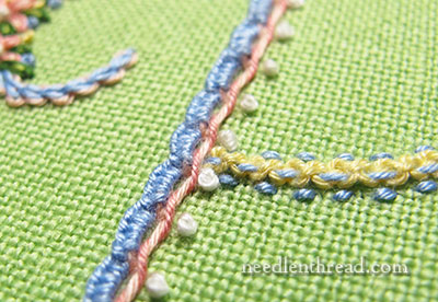
The stitches and combinations can be mixed and matched on any of the individual letters, and so can the color combinations.
For example, if I really like the color combination used on the S and the stitch combination used on the R, I can adopt some of the stitches from R and the colors from S and embroidery an M with them.
The stitches and stitch combinations in each letter are not too far off or different – just enough to keep them exciting and interesting – and there are some stitched elements that are always the same.
This lends the whole group of letters a certain coherence.
A little secret about this alphabet project: It’s been stewing in my head for a good year and a half. It came down to choosing between doing the Lavender Honey & Other Little Things projects, or these letters.
I thought, after finishing Lavender Honey, that I would be hard pressed to have so much fun again with a series a projects. But I was So Wrong! This alphabet has been a thoroughly enjoyable exercise in color combining and in stitch exploration. To me, it’s been an ideal outlet for Just Plain Fun Stitching.
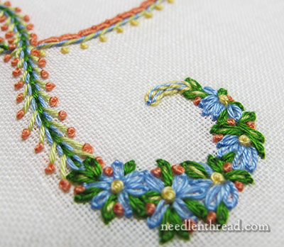
Another fun thing about this type of exercise with decorative initials (I always find it hard to call them “monograms” when they are individual decorative letters – there’s a difference, even though the terms are often used interchangeably today) is that the ground fabric can also come into play.
While I always tend towards white and creams as a ground fabric – a topic we already discussed in this article on the color comfort zone – any preferred color ground fabric will work!
It’s just a matter of ensuring the thread colors work with the ground fabric.
I’m not always 100% sure, though, that this is the case. But it’s good to experiment!
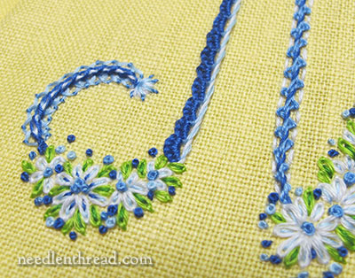
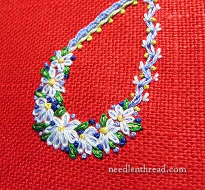
Sometimes, you know before you start that the ground fabric and the overall color scheme will work well together – blues and whites on yellow are a favorite combination.
But then there’s the matter of finding just the right green that will work with them. A green that’s too blue makes the piece look dull. A green that’s too yellow can make the piece look garish. And depending on the type of thread you’re using, you may find yourself quite limited in the choices of colors and shades within a general color family.
Again, that’s part of the fun of experimenting!
Ahhhh…. when working on white, it is a lot easier to be sure of a color combination! I love this particular group.
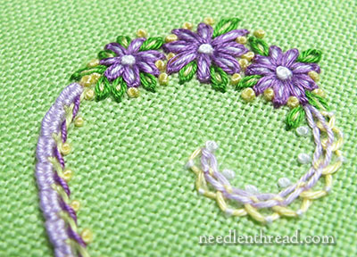
If you’ve been hanging about on Needle ‘n Thread for years, you might also know that I like green and purple and white. Ages ago, Needle ‘n Thread was green and purple!
When hemming and hawing over color combos, I often think of things I’ve seen or liked – color combinations in an outfit or on a website or in a favorite room of someone’s house – and try to work those together.
Sometimes it works. Sometimes it doesn’t.
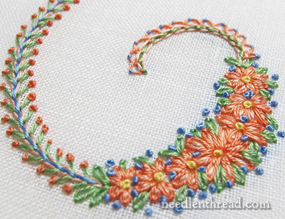
With this particular project, I’m finding that the letters work just as well in vibrant colors (remember the photo at the beginning of this article?), in classic color combinations, in pastels, primaries, muted earthy tones – whatever the color preference, it will work!
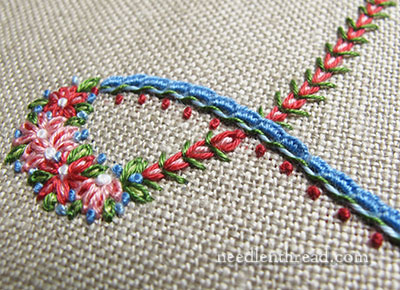
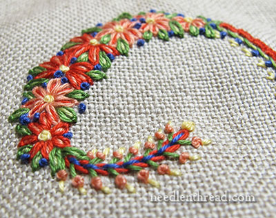
I find myself leaning very much towards natural colored linen as a ground fabric with this project, too. There’s just something about the way colors show up on this oaty background.
Your Take?
So, what’s your take on some of the color schemes in the photos here? Do any of them pop out at you and make you yelp “OH NO” – or does any one of them particularly grab your attention and make you cry out a resounding “YES!”?
Is there a particular type of color scheme that hasn’t been represented that you think would look particularly good and that I should consider working up for one of these samples?
And what about stitch combinations? Is there any stitch combination you see here that you think doesn’t work, or that you think looks odd?
I would love to have your input! Any thoughts to share on colors or stitches? Have your say below!