Making good choices about colors to use in hand embroidery projects can sometimes be a real challenge.
On the one hand, color is a very personal (and subjective) thing.
But on the other hand, it’s also an objective consideration. Colors have to work together to achieve whatever it is the artist or craftsperson is trying to achieve. If they don’t work, it’s obvious, and it can be a real turn off.
This doesn’t mean that color always has to be “pleasing to the eye.” It depends on what you’re trying to do with your embroidery. Maybe you want to use colors that might be considered less than pleasing, to make a point. Maybe you want to create something that is shocking or that grabs the attention in a non-conventional way.
But for the most part, we normally strive to use pleasant color palettes that, objectively, most people will look at and think, “That’s beautiful!” or “That looks good,” or “That works,” even if they don’t personally like the color families. We don’t normally want our color choices to jar the audience or repulse the viewer.
If you have trouble selecting colors that go well together, or generating ideas about colors you might want to use in your embroidery, you might just love Stitch Palettes.
I love it! It’s a visual pleasure to browse through. I find it calming, exciting, therapeutic, and inspirational, all rolled into one! It’s a fabulous resource!
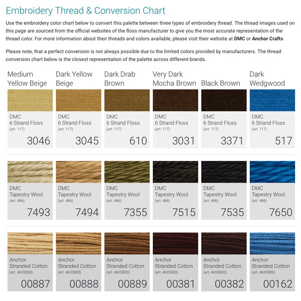
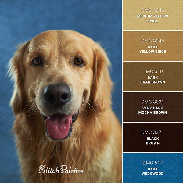
The website’s author, Krisztina, started creating her stitch palettes about six months ago, as a design exercise. Using photos that involve striking colors, she extracts the overall color scheme, isolates the colors, and then provides a variety of corresponding color resources for the extracted color scheme.
She starts with DMC floss numbers, and then she provides conversions for DMC tapestry wool and Anchor cotton floss.
And of course, if you want to go further with other thread lines, you can always start with that thread line’s conversion for DMC, if there’s one available. For example, you might want to work with an Au Ver a Soie silk. In that case, you’d take the DMC floss numbers and find a good conversion chart for Au Ver a Soie (from DMC to Soie d’Alger, for example), and pin down the converted color numbers. You might have to tweak the a bit to get exactly what you want, but you can see how the Stitch Palettes are a great springboard for making color choices.
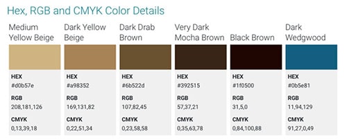
She also provides HEX, RGB, and CMYK colors for folks who want to use the same color schemes in graphics, web design, or print.
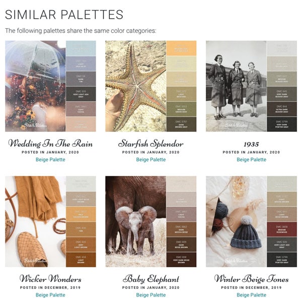
And, with each color palette, you’ll also find a curated collection of similar color palettes, in case you want to explore the color family further.
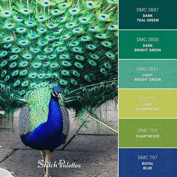
Interested in something peacock-ish? Stitch Palettes gives you a great starting point for selecting threads!
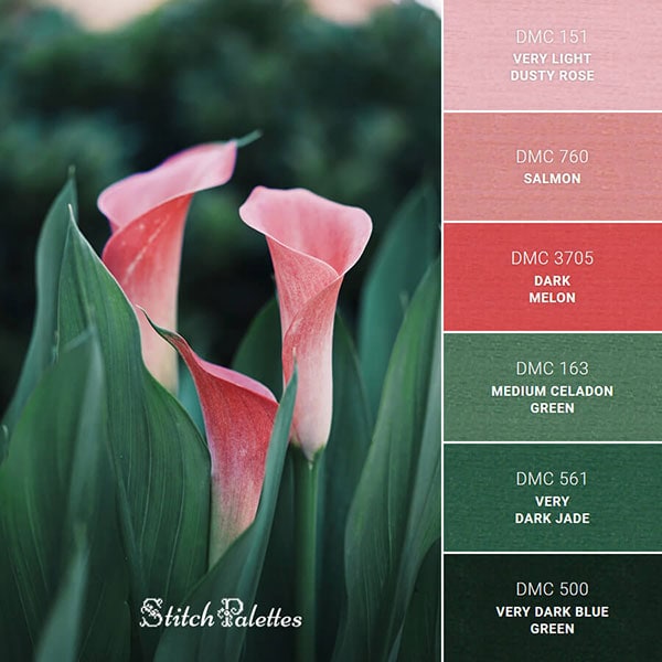
How about a delightful pink and green collection?
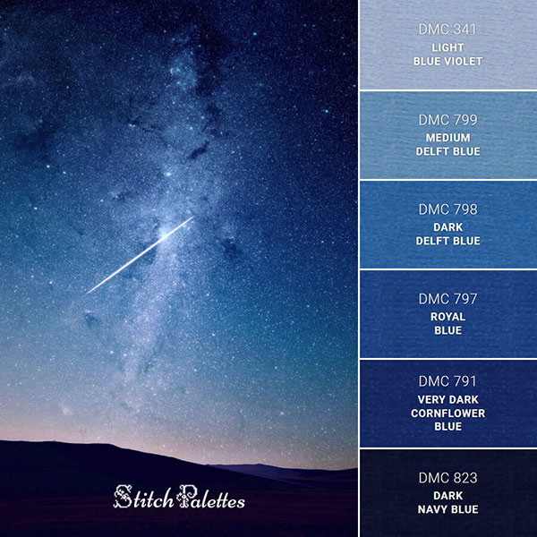
Or the glorious blues of a nighttime sky?
Whether you struggle with color choices for your needlework or not, Stitch Palettes is a fantastic resource for color ideas and inspiration!
Other Services
Krisztina also has a couple e-books available in PDF format, for downloadable themed collections (Christmas and Valentine’s Day). They’re a very affordable way to have a color design resource right on your computer or mobile device. in the e-book, she collects all the color palettes she’s put together thus far, that fit under the particular themes. I think they’re a great idea, and a good way to support her work, which is so helpful for stitchers.
She also creates customized stitch palettes, if you have a photo with colors you like and you’d like your own stitch palette created from it. You can check out her PDF collections and her stitch palette service here.
I hope you enjoy this resource as much as I do!
