I mentioned a couple weeks ago that it’s always a good idea to pick colors you enjoy embroidering with. If you Absolutely Cannot Stand a certain color palette, it would be difficult to carry through an entire project working with those particular colors.
Now, I love a blue-and-white, or a blue-and-yellow, and even a blue-and-natural color palette. And that’s what I had in mind for a Jacobean design that I have now started (and stopped on) twice.
Third time’s a charm?
I was having a hard time nailing down a range of blues I really liked. I tried to mix in some yellows to see if that would help. And then I tried blues and natural tones. And I was just never satisfied.
Then I kicked everything aside with a resounding harrumph (metaphorically speaking), and sat on it all for a while (equally metaphorically speaking).
And then I changed my mind all together.
I decided I wanted to modernize the look of the design. It’s a classic Jacobean-style design (if you’re a Needle ‘n Thread patron on Patreon, it’s available there).
A good way to modernize a classic design is through color and stitch choices. In order to do so, I needed to steer away from the typical classic colors of Jacobean work, as well as the typical colors that I would normally reach for.
I started thinking about things that I find mesmerizing. Things that I like to look at. Things that make me happy or intrigue me when I see them. And I started thinking about the colors of those things.
One thing that I find mesmerizing is sea glass. My eyes could wallow in a collection of sea glass for hours and not grow tired!
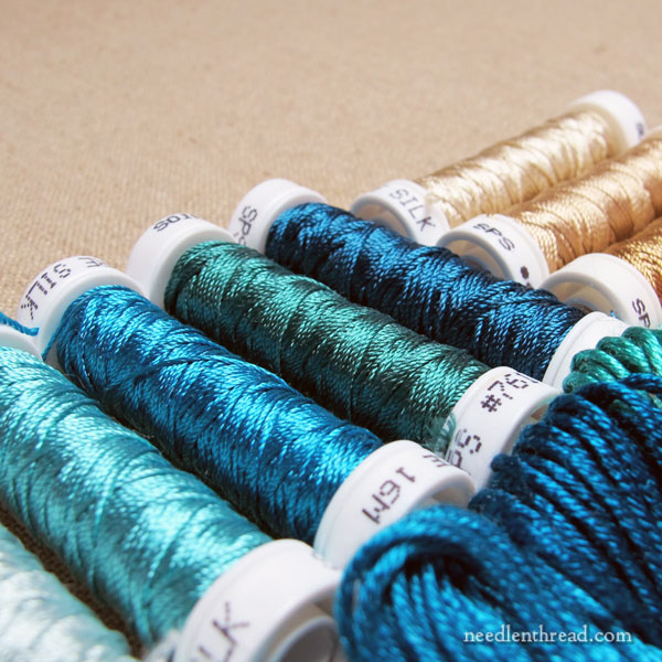
When I started thinking about sea glass, and then the sea, I started seeing color possibilities everywhere in my thread drawers.
What the heck?! Suddenly, there were ranges of blue-greens and green-blues I had never noticed before! Sandy shades started materializing before me as attractive, desirable colors. I might be on to something, I thought.
I started pulling colors and piling them up, then eliminating the ones I knew I wouldn’t want.
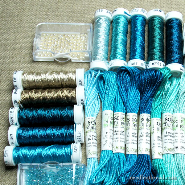
Eventually, I came up with a decent spread of blue-greens and green-blues, along with some sandy options. These gave me a good place to start.
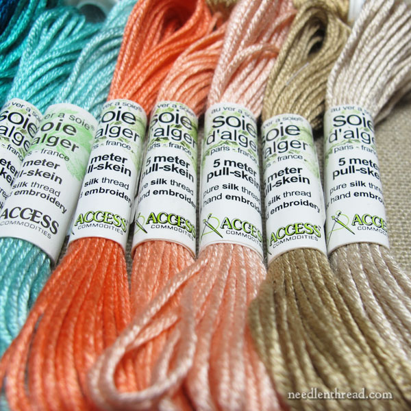
Then, as I contemplated the design and I contemplated the colors, I realized I needed a third – a color that tied into the sea-ish theme, but that wasn’t the sea itself.
And I settled on a rather bright, but warm and delightful, orange-coral. I pulled three shades that blend well together.
This is a color I would never normally select on its own, but it works well with the sea palette.
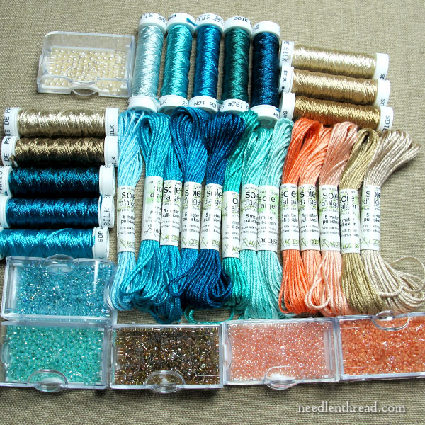
Then, it was time to consider beads, because I want to use beads on this project.
And lo! I was gobsmacked that I had several that seemed to work well with all the colors I pulled. This rarely happens. Why in the name of all that is bead-ish would I ever have beads in these shades of orange?
It’s a sign, I said.
The whole collection, laid out, made me rather happy!
I really should have photographed the threads on white, but … we’ll save that for later. You can get a pretty good idea of how the colors work together. I certainly won’t use every single shade and thread type (I’m pretty certain, anyway!), but I like to pull an excess of threads and colors, just to make sure I have a good variety to pick from when I start stitching.
Since I was very excited about finally settling on a color collection that I will really enjoy stitching with, I had to try them out.
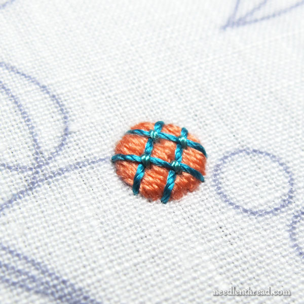
I picked an accent element in the design and stitched a wee dot in padded satin stitch using Soie d’Ager. Then I couched a lattice design over the top of it with Soie Perlee.
Silk. Sea. Stitching.
Satisfied!
I’ll share progress with you as I work my way through this design, along with any kerfuffles along the way!
More soon!
