After yesterday’s True Confessions about the small monogram sample that went from an hour-long project to an almost-five-hour-long project – and all the doubts and discoveries along the way – I thought I’d share the finished monogram with you.
Upon finishing the embroidery on the little R and blocking it, I drew some more conclusions about it.
One may surprise you!
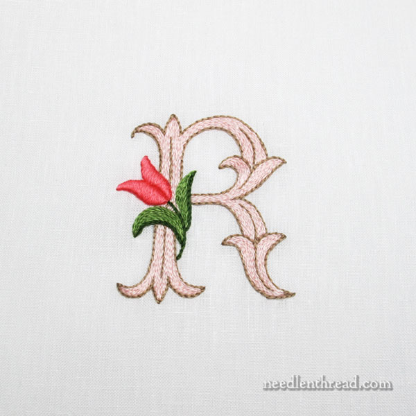
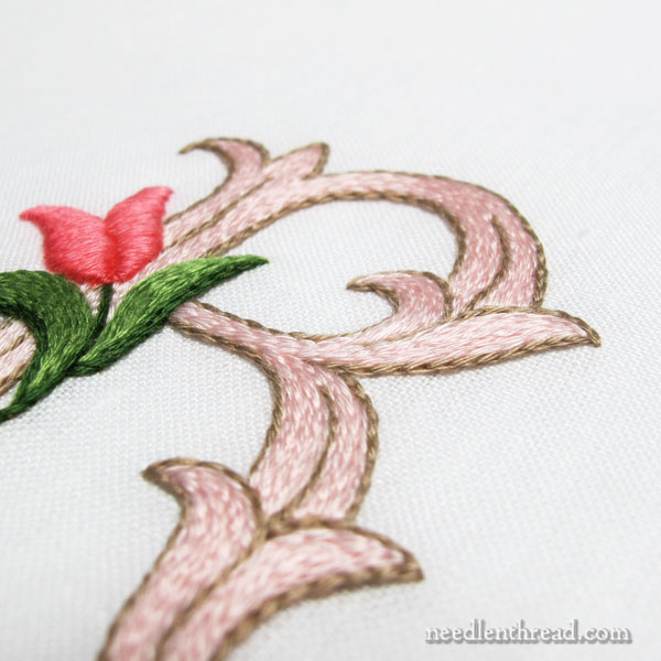
Here’s the finished R, decorated with a little tulip, and embroidered with floche using split stitch, stem stitch, and padded satin stitch.
The letter itself is 2.5″ high, so it’s not a small monogram, but it’s also not a huge monogram. I think I would like this particular letter style better a little smaller, at about 2″ high.
(You’re welcome to click on the photos for larger images, by the way…)
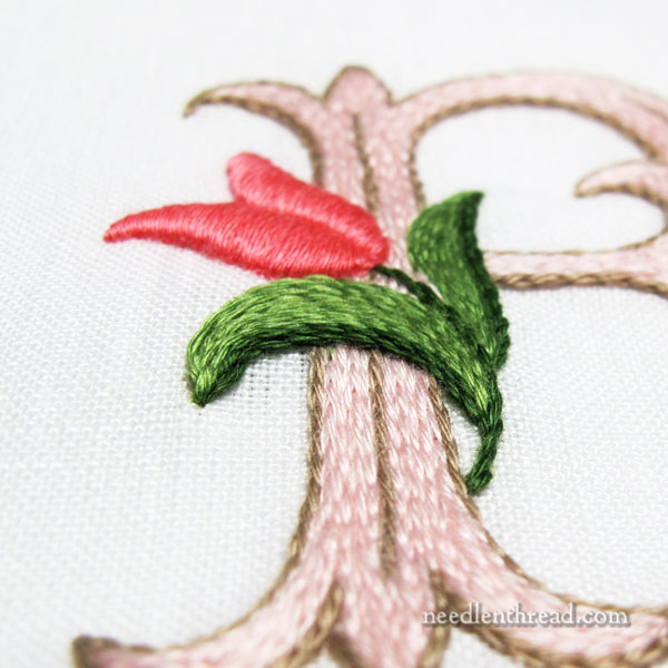
If I were to work this monogram again in split stitch, one definite change would be the tulip’s leaves.
The texture of the leaves (worked in stem stitch) and the letter (worked in split stitch) is similar. There should be more contrast in textures there, especially due to the proximity of the smooth surface of the flower in satin stitch.
In fact, the flower ends up rather isolated, even from the leaves, because it is the only element of a different texture.
These are the options I’d consider, if I were maintaining the split stitch filling:
1. Stitch the whole thing flattish, using split stitch and stem stitch (including the tulip). It would look a little cartoony, I think, but it would be more coherent.
2. Embroider the flower, including the leaves and stem, all in padded satin stitch, which would offer decidedly more contrast across the whole decorative element. And the height of the padded satin stitch would impart a little illusion of shading to the flower element.
3. Use long and short stitch on the flower and the leaves and satin stitch on the stem. This would offer a little textural contrast (not as much as padded satin stitch) and also some contrast in the color arrangement. You can see an example of long and short stitch worked in floche here.
My gut instinct, if the letter were to remain split stitched in the color scheme on the sample, would be approach #2. I think option #2 would work best with the design of the letter, which seems to demand a clean, simple approach.
Concerning the color scheme, would I change it?
Actually…in retrospect…
I wouldn’t.
If I were maintaining this stitching approach (split stitch, outlined and filled), I like this taupe-y brown / pale pink. It’s somewhat ice-cream-parlorish, but it’s still classic and it doesn’t jar the eyes.
If I were to go with a blue-green version, I’d probably maintain the taupe-y brown and go with the palest of blue-ish greens, turquoises, sea greens – something like that – very, very pale. In which case, the color of the leaves on the tulip might change, and perhaps the color of the flower, too.
Interestingly enough, upon finishing the monogram and blocking it, the Optimistic Half of Me that I told you about yesterday won out.
Despite all my misgivings, despite my grumbling with and berating of myself along the way, despite the fact that I still don’t like the ground fabric, when all was said and done, I discovered that the finished monogram isn’t all that bad. If I were doing it again, I’d make a few changes, but overall, I like it a lot!
Another lesson learned: sometimes, perspectives change when you come to the finish line!