Lately, I’ve been sharing with you all kinds of ways you can embroidery monograms, using techniques that are accessible for beginners and beyond, and highlighting different lettering styles from my recently released e-book, Favorite Monograms.
The purpose of these sample monograms is to show you that you can embroider beautiful monograms in a variety of stitches – that monogramming isn’t limited to any one kind of stitching technique.
So far, we’ve looked at several styles of voided monograms: this voided confetti monogram, this simpler voided monogram in just three colors, and this rather elaborate floral voided monogram featuring lots of color and texture.
Just last week, we looked at this monogram, embroidered with a few simple stitches in a few colors.
Today, I want to show you the beginnings of a filled monogram that’s easy to stitch and that incorporates a little bit of shading. The results: a classy, pretty monogram that’s a little more intricate than last week’s simple monogram, but that’s still super accessible.
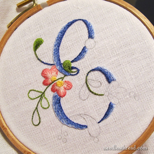
This monogram E is taken from the floral script alphabet in Favorite Monograms. You can also find letters A-L available here for free. Eventually, I’ll finish adding the rest of the alphabet to Needle ‘n Thread, but if you’d like to find it all in one place, it’s available here, in Favorite Monograms.
As you read this article, you can click on the photos to examine larger versions. Anywhere there’s a link on a stitch name, the link will take you directly to a tutorial for that stitch.
Materials
For this particular E monogram I’m using the following materials:
Alba Maxima embroidery linen
DMC stranded cotton in the following colors: Blue (light to dark: 3840, 3838, 792, 791); Green (light to dark: 470, 937); Pink (light to dark: 3713, 899); and Yellow (727).
4″ embroidery hoop, with the inner ring bound
#7 & #9 crewel needles
Stitches
Once finished, the monogram will involves fives stitches: stem stitch, split stitch, long & short stitch, French knot, and satin stitch dots.
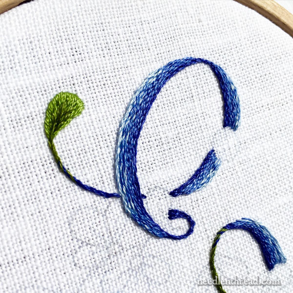
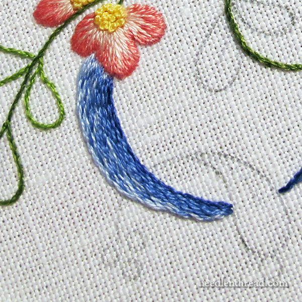
I embroidered the letter first, using stem stitch filling.
Since I wanted the filling to be a little sketchy in shading from dark on the innermost line of the letter to light on the outermost line, I mixed the shades of blue in the needle.
So, on the inside of the letter, I had two strands of floss in the needle (the two darkest blues, 791 and 792). I stitched the inside outline of the letter in stem stitch with these two shades in the needle at once.
Then, I switched to 792 and 3838 in the needle, working another line of stem stitch right up next to the first.
The next two lines of stem stitch were worked in two strands of 3838, which is the medium blue in the range I used.
Then, I switched to a strand of 3838 (medium blue) and a strand of 3840 (light blue) in the needle, for the next two rows.
I finished the outermost edge of the letter with two strands of light blue (3840) in the needle.
Switching the colors up like this gave the shading on the letter a more natural look and made the whole letter look a little heathery or sketchy. That’s exactly the look I was going for. I wanted shading, but I wanted it to be subtle, avoiding a stripy look that can often result when shading with stem stitch.
This is the letter part, finished.
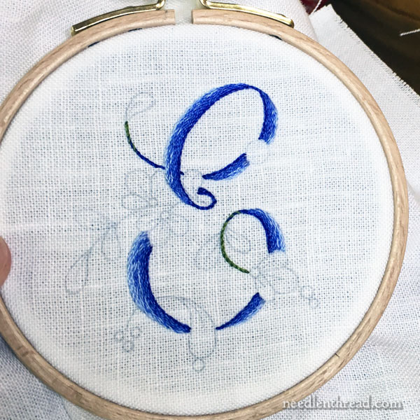
When you’re working stem stitch with two shades of color in the needle at once, you can’t always predict which of those shades is going to be dominant, and where it’s going to show up.
While the upper half of the letter worked great, I wasn’t as pleased with the medium and light blue shading on the left side of the lower half of the E.
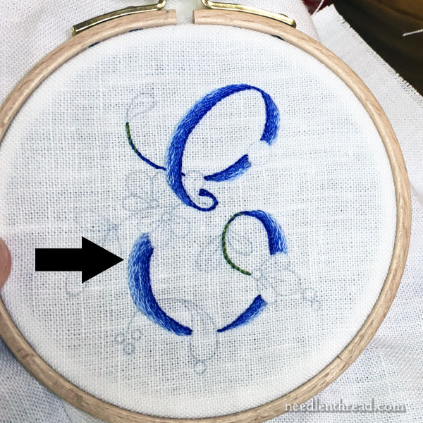
That’s right in here. See how blotchy it is? The light blue is dominant in that area, due to the twist of the two threads while I worked the stem stitch. There’s very little medium blue, and when it does show up, it all clumps together!
To solve that, I took one strand of medium blue in the needle, and I worked it over a few of the stem stitches in that area, to “speckle in” a little more of the medium blue.
This helped spread the medium blue out in the lower half of the E and got rid of the blotchy look.
I’m still not perfectly happy with the area just below the flower, where the stem stitch starts. I may yet fiddle with that a little bit and touch it up.
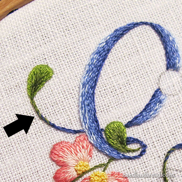
On the tips of the E, where they end in what looks like the rest of the leaves in this design, I combined the darkest blue (791) with the dark green (937) in the needle as I worked the stem stitch towards the base of the leaf.
When I was about three stitches away from the base of the leaf, I switched to two strands of dark green in the needle. This helped create a gradual transition from blue to green as I approached the leaf.
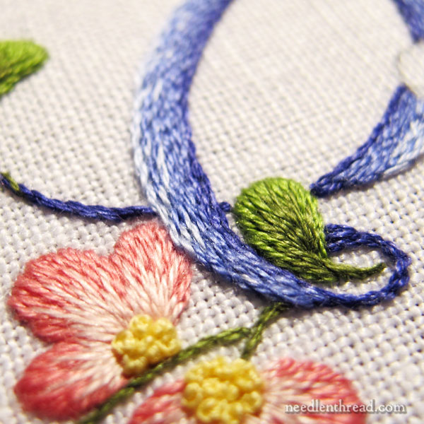
I embroidered the flowers and the leaves in long and short stitch, worked over an outline of split stitch. Both the outline and the long and short stitch are worked with one strand of floss.
You can find a photo tutorial on how to embroider a petal shape in long and short stitch here. It’s a pretty old article and the photos aren’t the best, but the principles are there.
The center of the flowers are worked in French knots, in yellow, using two strands of thread.
The Tongue
I know I’m not the only one who sees the overlapping element on the base of the E as a tongue! I can’t help it!
Now, I could increase that effect (why would I want to?!?) and embroider that in pink, but don’t worry. I won’t. That overlapping element will be embroidered in blue, like the rest of the letter, and I believe it will minimize the look of the tongue.
We can always hope, anyway!
So, that’s this letter so far. I’ll show you the finish pretty soon!
Any questions? Comments? Suggestions? Feel free to chime in below!