Do you ever have problems making good color decisions for your own embroidery projects? I do!
There are ways to help yourself when it comes to choosing colors for embroidery projects – I’ll give you some suggestions on that topic below.
But I thought I’d share with you some monograms I’ve been fiddling with lately. I gave you a sneak peek of one of them in this article about my leafy tree project a few weeks ago.
Since then, I worked up another sample letter in a color scheme that I thought I’d really like. As it turns out, I’m not that keen on it! We’ll chat about why, what I can do to improve it, what my limitations are in these particular circumstances, and what I’m going to do next.

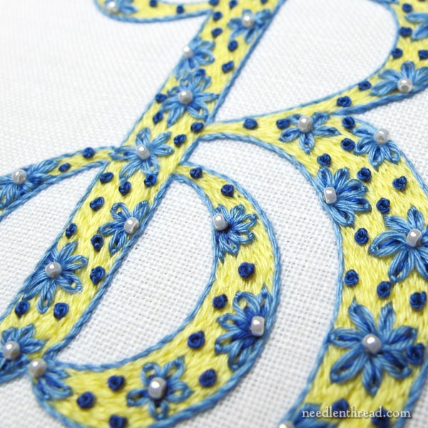
This is the monogram that showed up at the end of my tree article several weeks back. It was really meant to be a quick in-between project, something fun and relaxing that I could pick up for a quick stitching fix, and I really didn’t have deep plans for it. I just wanted to play with some ideas that were floating in my head.
I’m using a hand written calligraphy alphabet that I re-worked to make suitable for filled embroidered letters. The ground fabric is linen (Alba Maxima, which is my favorite for general surface embroidery) with cotton floche for the thread. The letters at this point of play are 3″ high, but I will reduce them in size on the next round of experiments.
I love yellow and blue and white. It’s a favorite color combination. And I think, for this letter, the idea came together pretty well.
But I like other color combinations, too, so while working through the lettering experiments, I thought I’d test some other favorites.
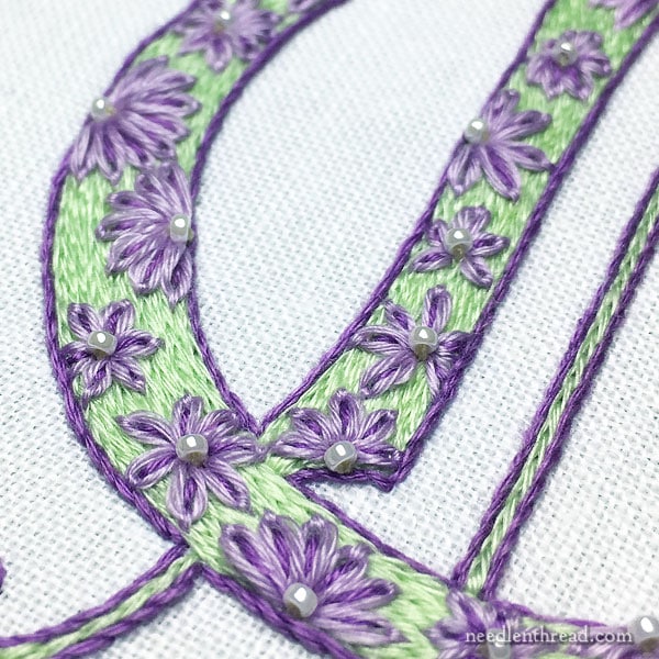
Purple and green? Sure!

Normally, I’m a huge fan of purple and green – I used it in this embroidered monogram and loved it! And for those who have been hanging around Needle ‘n Thread for a long, long time, you might remember that my original website sported a purple and green color scheme.
So I have nothing against the combination, and in fact, I like it very much.
But… it doesn’t always work.
On the letter above, the green hue is just slightly “not it.” It doesn’t do it for me.
I don’t think the icy green is the best choice with these particular purples.
The value, too, of the lighter purple and the lighter green, while not exactly the same, is a little too similar. The flowers just don’t pop.
The whole piece comes off as somewhat insipid and weak, which isn’t quite the look I’m going for on these letters.
How to Fix It
I think, to bring a little life to the letter, the key is changing the green to a slightly brighter, light grass green.
My limitation is in this case is that floche is not available in the color of green I would like to use. The grassy green it’s available in is too dark. The lighter greens that have a tinge of yellow to them are too olive.
There is the possibility of passing on purple and green, and trying purple and yellow instead. A bright sunny yellow would most likely work, but it’s not quite purple and green then, is it?
So, I can try a different thread, or I can switch color combinations.
I will most likely play with both approaches and let you know what works and what doesn’t and why.
Some Helpful Resources
If you’re looking for some help with color choices, or if you want to learn about color, here are some resources that may come in handy.
Books:
Colour Confident Stitching by Karen Barbé is an excellent book that can help the stitcher make good color choices, while learning about color concepts. I’ve reviewed the book here, if you want to see what it’s all about. The book has usable color schemes in it in abundance. It’s worth having on your bookshelf.
Trish Burr also has written a book called Colour Confidence in Embroidery. While her book touches on color theory, too, it’s a little lighter in that regard, compared to Barbé’s book. It has many good points about choosing colors for embroidery projects. It’s also got quite a few colorful needlepainting projects in it and it features some great color schemes. You can find my review of it here, if you want to read more about it.
Many folks find Joen Wolfrom’s 3-in-1 Color Tool (used more in quilting) helpful for selecting colors that work together. I have one, I’ve used it, and it has helped me select colors in some cases, but mostly, I go by eye. Things seem to get too complicated if I start using tools and over-thinking! But other folks really like having a tool like this one handy.
You can find both of these books and the 3-in-1 Color Tool listed on my Amazon recommendations page, here, if you want to look at what other people are saying about them, too.
Online Articles:
This is a good basic article on understanding color theory. It’s not super in-depth, but it will give you the basics in a way that’s easy to understand.
Lifehacker also offers this decent article on the basics of color theory. They also mention some color apps that perhaps could be helpful.
Most online design articles about color usually focus on digital or print color, but the basic concepts regarding color combinations, choices, hues, values, shades, and so forth are the same, whether you’re using it in print, in online work, or in embroidery.
Chime In!
Any questions, comments, suggestions about color? What do you think of the purple-green combination? What would you change? Any color resources you’ve found helpful that you’d like to share with other stitchers? Feel free to chime in on the conversation below!