Earlier this year, I shared some sneak peeks on a hand embroidery project I was working on, but hadn’t finished.
I finished it! And that was quite a while ago!
But then I never showed it to you, completely. I’m still not sure what I’m going to do with it – maybe it’ll turn into a step-by-step project or something. We’ll see!
I thought I’d show it to you today and tell you a little bit about my thought processes while working on it, what my ideas were, why I named it what I did, and so forth.
If you’ve been hanging out with me a while on Needle ‘n Thread, you might already know I have a problem naming projects. It always amazes me how designers and stitchers come up with fantastic names for their needlework – names that just fit.
I’m not so good at that. But this particular project worked out ok, name wise. I think it fits.
Maybe…?
When I started working on this particular design, it was just a doodle of a very stylized, fantastical sort of thingamabob, after the fashion of a similar thingamabob in a very old needlework book.
The picture in the older book (in black and white) featured a goldwork piece, I believe, but you couldn’t really tell it was goldwork, except for the fact that there was a bit of texture in it typical of metal threads.
I liked the design, but I didn’t like it in the goldwork, which made it look (especially in black and white), very heavy. So I set about doodling and altered it a bit, lightening the element up a little.
I don’t even know what you’d call this kind of design element. A friend suggested something akin to the palampore elements seen in Indian-influenced designs.
Palampores were printed textiles from 17th century (maybe earlier?) India, that were very influential in developing the European fabric and textile trade from the 17th century onwards. They featured stylized flora and fauna. The design elements had a huge influence on patterns in chintz fabric, and they can still be seen in fabrics today.
I suppose the design might be a little like the palampore design elements, but it lacks the layering I usually associate with the stylized flora in those designs.
In any case, my idea when I was doodling was to stitch something in a limited palette of silk threads (but perhaps more than one type of silk), using a variety of stitches and fillings, in a way that didn’t look heavy.
Once I was satisfied enough with the design, I transferred it to linen, selected the colors I had in mind (and shades thereof), and started playing with filling stitches.
I wanted the combination of the design and the choice of fillings and stitches to make the piece vibrant and lively – showing off the silk – without being heavy and bulky.
Well, that’s what I was thinking. Did I accomplish it? I don’t know. I think maybe I did. There are still some things I’d tweak if I were doing it again, or if I were making it available for others to stitch.
Even before I finished stitching this, I was calling it Fantasia in Silk.
Ok, wait! I’ll be honest and tell you a bit more about the name development! Before the name morphed into Fantasia in Silk, I was calling the piece Bella Fantasia, as a kind of play on words.
Bella Fantasia (pronounced fan-ta-see-a) ran in my head to the tune of a favorite song. The words took the place of the opening lyrics to “Nella Fantasia,” which was popularized by Sarah Brightman in the 1990’s, but the tune itself is an Ennio Morricone piece from the movie The Mission, titled “Gabriel’s Oboe.”
So, why that song?
Well, I grew up playing the oboe and the clarinet, and this particular piece from The Mission has been a favorite ever since the movie first aired way back in the late 1900’s (I love saying that!) – 1986, to be exact. I was in high school and playing the oboe at the time. It was my favorite tune. It was the first all-oboe tune I played that made me feel like I was a “real” oboe player.
Even though the tune and my new lyrics wafted through my head when I was stitching the thing, I still realized that Bella Fantasia (Beautiful Fantasy) might be a bit too aggrandizing.
It just seemed a bit much, to call my own piece “Beautiful Fantasy.” I cringed every time I thought about keeping that name!
So instead, I started calling it Fantasia (this time, pronounced like Disney’s movie) in Silk.
Better, I thought. It gets the fantastical sense of the design across, along with the vibrancy of the silk, without the overly grand sense evoked by Bella Fantasia.
So that’s the name that stuck – Fantasia in Silk.
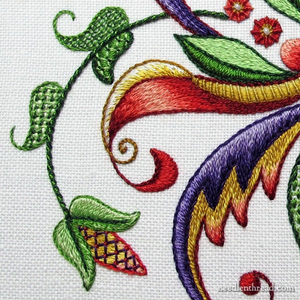
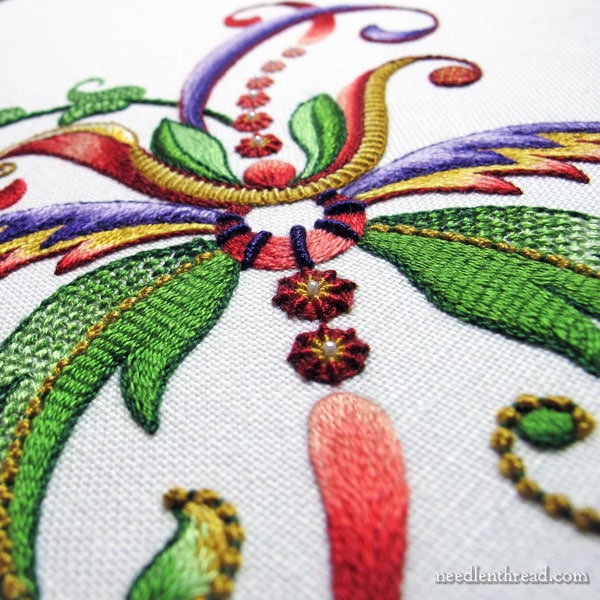
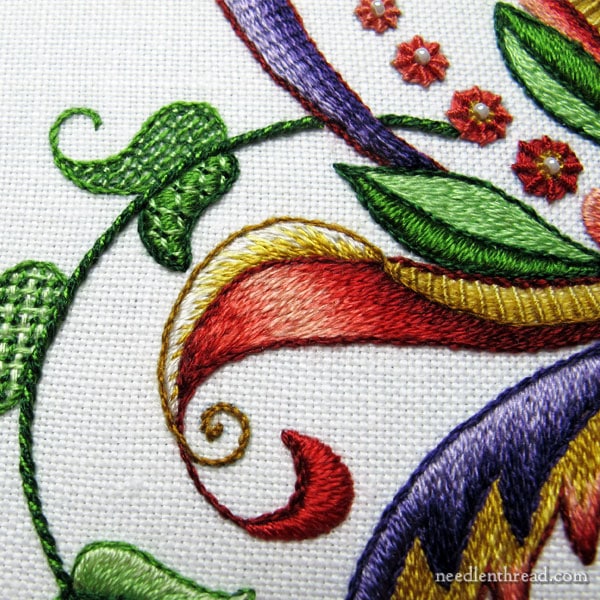
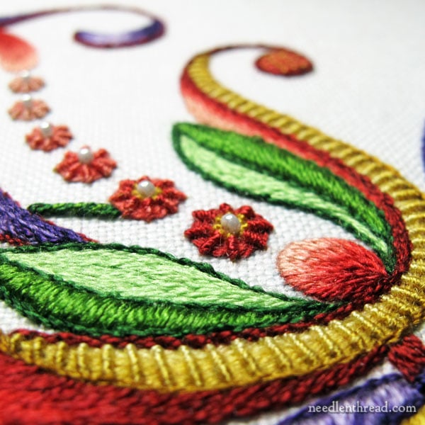
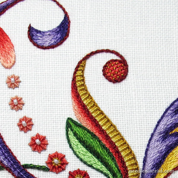
This piece embodies much of what I love in hand embroidery: silk embroidery thread, shading, lots of stitches, a touch of subtle bling (the tiny beads), some texture and contrasts in texture, and an obviously stylized design.
I was able to incorporate six different filling techniques altogether, along with some variations in lattice fillings and a few different types of textured stitches.
I used two types of silk – Soie d’Alger and Soie Perlee. In retrospect, I would probably try to incorporate a little more of the Soie Perlee, especially in a more visible way. Much of it is used as foundations for stitches and covered with Soie d’Alger, so it isn’t seen too clearly.
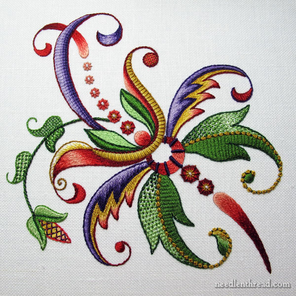
And this is the finished fantasy.
It was an extremely satisfying piece to work! And while I can still see areas I’d tweak, I like the way the whole thing came off.
I may revisit this one. I’d probably play with the design a little bit, to ground it somewhat so it isn’t just a Thing, floating about alone on the vast expanse of otherwise blank fabric. And I’d probably toy with other thread weights, too, and perhaps alter some of the color choices.
I’m always open for input, of course! If you’d like to make suggestions or add some constructive criticism or what-have-you, you are most welcome to join the conversation below!
